Title Research Analysis Blog Post
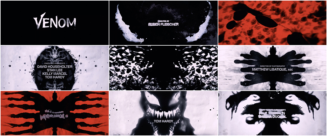
Taking a look at how films implement titles in there media, its clear that we see a trend of them conforming to their genre conventions. Although not always, we can see a little foreshadowing or giveaway if you will on the type of genre a film is just off the titles alone. Wether its the font or the way they are intertwined within the film that connect ideas or build a scene they alway find a way to fit. To examine further and more specifically we can look at the opening of Venom. The opening VENOM text font gives a small tell on the horror we can expect and a fitting dark ominous background. Again we see a play with the genre conventions of horror, dancing between the dark colors and a bloody red. Ending the introduction with a faded picture of venom himself, alienated looking in horror to create the ambiance. In all the text or title scenes that every film, movie, or tv show produces while to some may very well be a miniscule part it helps get the ball rolling in painting and creating a starting point allowing for a connection and free flow from the horrific intro to the rest of the plot to unfold, a perfect opening.


Comments
Post a Comment